


Cart
0
Interiors
The one wall that still makes the whole room feel unfinished
You have done the work. So why does the room still feel like it is waiting for something?

The renovation is finished. The floors went in months ago, the sofa was worth the wait, and you finally got the lighting right — warm, layered, nothing overhead and glaring. People come over and say the room looks beautiful, and they mean it.
And yet you keep looking at that one wall.
It is usually the biggest one. Behind the sofa, above the sideboard, the long stretch you see the moment you walk in. It has been bare for a while now, or it has something on it that you have quietly stopped liking — a piece that was meant to be temporary, or something that seemed right in the shop and has looked slightly wrong ever since.
Nobody else mentions it. But you notice it every single day. And the strange part is that the more finished the rest of the room becomes, the more obvious that wall gets. A half-done room hides an empty wall. A beautiful one does not.
Why this particular wall is so hard
It is not indecision. It is that the stakes feel higher than they should.
Everything else in the room had a reason — the sofa had dimensions, the paint had a sample, the flooring had a budget. Art has none of that. It is the one decision made purely on instinct, on the largest and most visible surface in the house, and the failure modes are unforgiving. Too small and the wall looks emptier than before. Too generic and the whole room quietly drops a price bracket. Too trend-driven and you will resent it within a year.
There is also a professional habit at work here. Designers plan the structural things first and treat art as the finishing touch — which is correct, except that the finishing touch is usually where the budget has run out and the attention has moved on. The result is a lot of well-designed rooms with something forgettable hanging in the most important spot.
What the right piece actually does
Here is the part most people underestimate: the right piece does not fill the wall. It finishes the room.
It is the same furniture you already own. The room simply reads as finished.
Scale and texture on a large wall change how everything around them reads. A mid-range sofa looks considered. A simple rug looks chosen rather than settled for. The lighting suddenly has something to fall on. It is the same furniture you already own, and the room reads as more expensive — because it finally reads as finished.
That is the difference between decoration and resolution. And it is why the ten pieces below are here: each one is built at a scale that works on a large wall, and several are hand-embellished — real brushwork applied over the surface, rather than a printed impression of it.
The ten
1
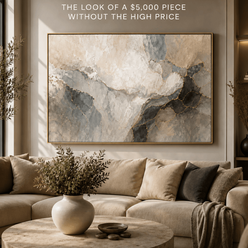
Whispered Horizon
The one that finishes the room
Muted horizon bands in cream, stone and the faintest gold, hand-embellished so the light moves across it through the day. Of everything here, this is the piece people describe as looking like it came from a gallery rather than a website.
It is the most versatile large-format option on this list. It does not compete with your furniture, your rug, or your existing art. It simply makes the wall look intentional, which is the entire problem you were trying to solve.
If you only read this far, this is the one most people should start with.
2
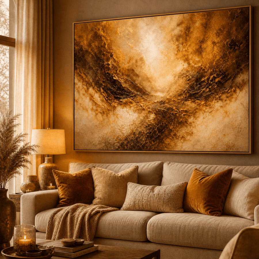
Ember Horizon
The colour of late afternoon light
There is a particular warmth that arrives in a room about an hour before sunset, and this piece holds it permanently. Deep amber moves through burnt sienna into something close to bronze, and because the surface is hand-embellished, the texture catches whatever light the room already has. It reads as warm without reading as loud.
On a large empty wall it does the thing most art fails at: it gives the eye somewhere to rest without demanding attention. If your room runs cool — grey sofas, white walls, black metal — this is the piece that stops it feeling like a showroom and starts it feeling like somewhere people live.
Many people start here when the room is finished but feels slightly cold.
3
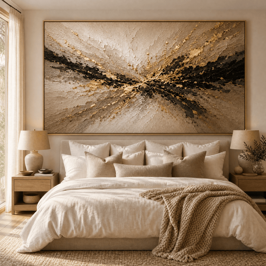
Black & Gold Textured
For the wall that should stop people talking
Cream and deep black, broken by gold that was applied by hand rather than printed. At the larger sizes this stops being decoration and becomes the reason the room is arranged the way it is. It is the most confident piece on this list.
This is the answer for a genuinely large wall — the kind above a long sofa or a dining table — where anything smaller looks apologetic. The contrast means it holds its own from across the room, and the hand-applied gold means it rewards standing close.
If you have been putting off the biggest wall because nothing felt substantial enough, this is usually the one.
4
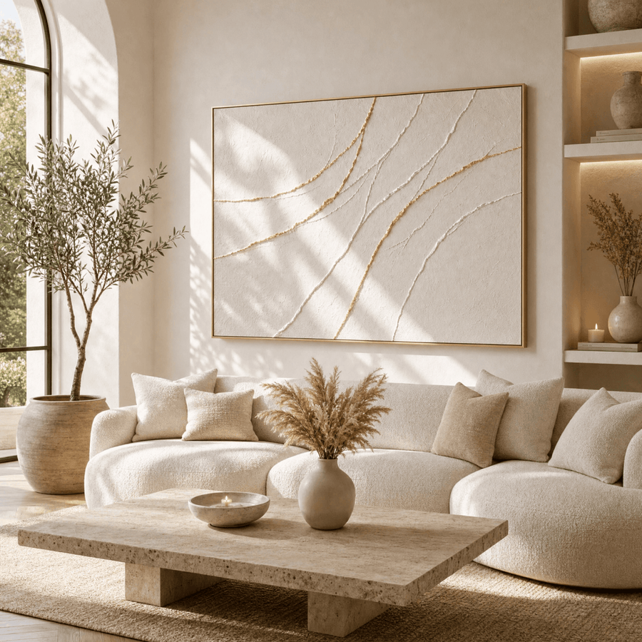
Gilded Flow
Quiet, but not empty
Soft cream, warm ivory, and gold that moves across the canvas like water finding a level. Almost no colour, and yet nothing about it feels bare. The texture is doing the work that colour usually does.
This is the piece for people who want the wall finished without introducing a new palette to manage. It sits with almost any furniture, any flooring, any existing artwork. In a room that already has a lot going on, it settles everything down.
One of the safest choices on this list, and one of the most reliably beautiful in person.
5

Sisterhood
Gold, ivory, and the suggestion of company
A gathering of figures worked in gold and warm ivory, in the tradition of Klimt but pared back — less ornament, more line. Figurative work does something abstract cannot: it puts human presence in the room, and a room with people in it never quite reads as empty.
On a large wall this reads as collected rather than bought — the kind of piece that suggests the space came together over years rather than in an afternoon. The gold does the elevating, but it is the figures that make people stop.
Strongest in a living room or an entryway, where the first thing someone sees sets the tone for everything after it.
6
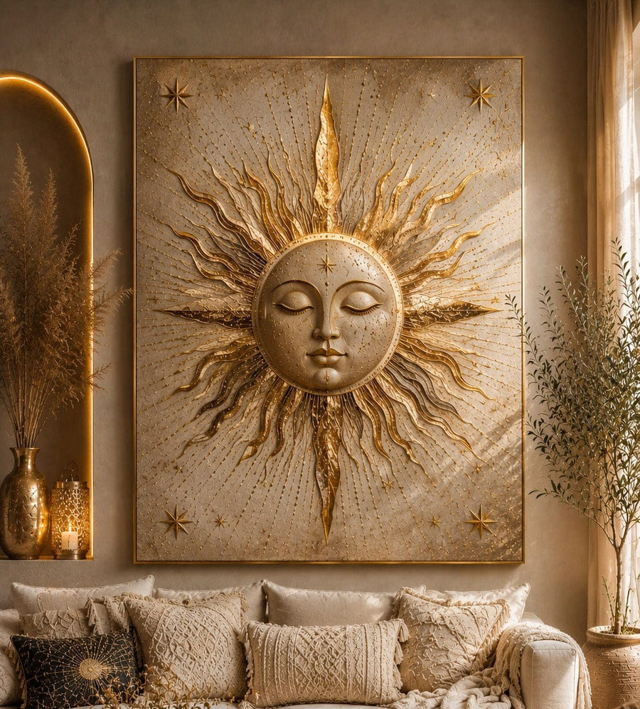
Celestial Golden Sun
Warmth, in the shape of a sun
A gold sunburst radiating across a warm neutral ground — the boho language people actually want, stripped of the clutter that usually comes with it. The rays give the piece a quiet symmetry, so it reads as calm rather than busy, and the gold lifts everything around it.
On a large wall a circular form does something rectangular art cannot: it softens a room full of straight lines. Doorframes, shelving, the edges of a sofa — a sun breaks all of that up and makes the space feel less architectural.
A strong choice for an entryway or above a console, where you want the first thing people see to feel warm.
7
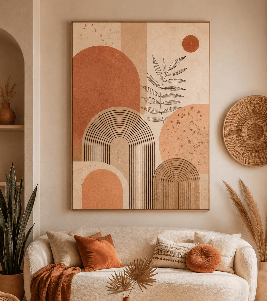
Terracotta Boho Geometric
Structure, warmed up
Clean geometric forms in terracotta, sand and bone. It has the discipline of modern abstract work but none of the coldness — the shapes are simple, the colours are warm, and the balance feels deliberate rather than clinical.
This is the piece for a wall that needs order. If the room is a little busy, or the furniture is a little mismatched, a geometric piece imposes a quiet structure that pulls everything into line.
Works especially well flanking a fireplace or centred above a console.
8

Turquoise Aerial Seascape
The getaway you can hang
Shallow turquoise water seen from above, hand-embellished so the surface has genuine movement. It is the only piece on this list that changes the temperature of a room outright — a space with this on the wall feels several degrees cooler and considerably further from work.
On a large wall it functions almost like a window. In rooms with limited natural light or no view worth having, that matters more than people expect.
The obvious choice if the room is warm, south-facing, or you simply want somewhere to look that is not here.
9
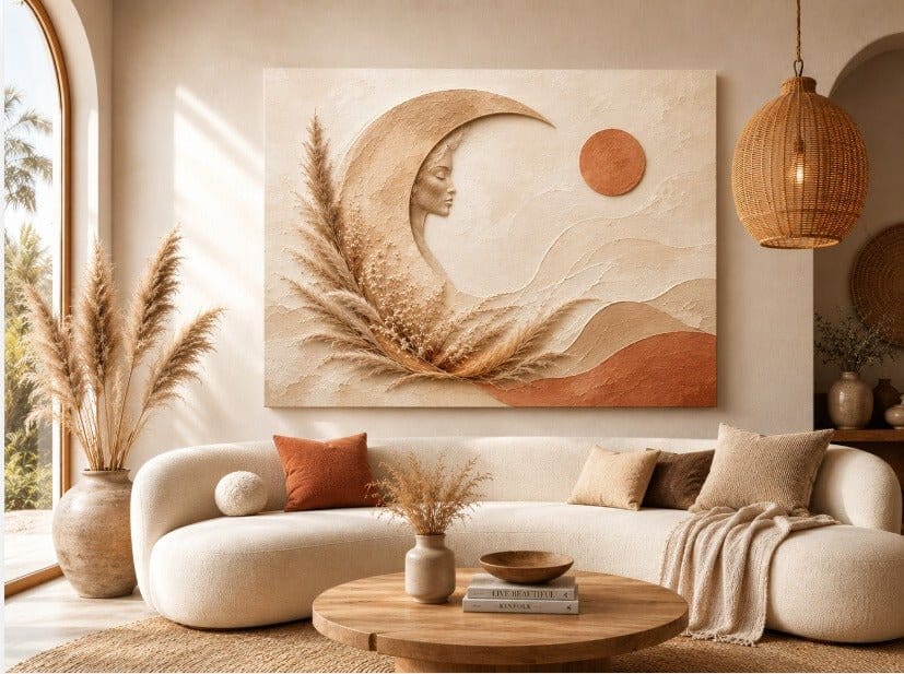
Moon Goddess Pampas
Soft, celestial, unhurried
Pampas grass and a low gold moon in a palette of oat, bone and warm sand. It is gentle without being forgettable, and it carries the boho language people actually want — texture and warmth, not clutter.
Large blank walls in bedrooms are the hardest to solve, because anything too strong keeps you awake and anything too soft disappears. This sits exactly in between.
A frequent starting point for bedrooms, and one of the easiest pieces here to live with long-term.
10
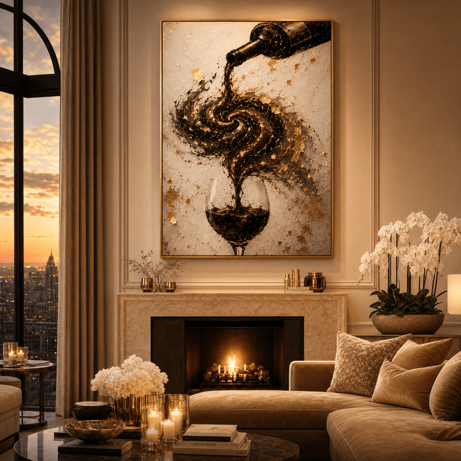
The Last Pour
For the room where people stay late
Deep wine red and gold, handled with a surreal edge that keeps it from being literal. It has the confidence of a piece chosen for a particular room rather than bought to fill a gap, which is why it works best somewhere with a purpose — a dining room, the wall behind a bar cart, the corner where the conversation ends up.
Red is the colour most people avoid on a large wall, and the one most people regret avoiding. At scale it does something no neutral can: it makes a room feel warm at night, under lamplight, when the space is actually being used.
If the wall you are staring at is somewhere you entertain rather than somewhere you pass through, this is the one to take away.
How to choose between them
Start with scale, not style. The most common mistake on a large wall is going too small. As a rough guide, art should span somewhere between two-thirds and three-quarters of the furniture beneath it — above a standard three-seat sofa, that usually means the largest size offered rather than the middle one. Portrait pieces work differently: they suit narrower walls, the space beside a doorway, or a pair hung together. If you are torn between two sizes, the larger one is almost always right.
Then match the temperature of the room, not the colours. You do not need the art to repeat a colour already in the space — that tends to look matched rather than collected. What matters is warmth. If your room runs cool, choose something with amber, gold or terracotta in it. If it already runs warm, a cooler piece will open it up rather than close it in.
Hang it lower than feels natural. The centre of the piece should sit at roughly eye level, around 57 to 60 inches from the floor, and about 6 to 10 inches above the back of the sofa. Almost every piece of art in almost every home is hung too high, which is why so many rooms feel subtly unsettled without anyone being able to say why.
The wall is the last thing. It is also the thing people see first.
There is a moment, a day or two after the right piece goes up, when you walk into the room and do not think about the wall at all. That is the whole point. The room stops asking for something. Everything you already chose — the sofa, the light, the floors you agonised over — finally reads as one deliberate decision rather than several good ones.
Every piece here arrives stretched over a solid wood frame with the hanging hardware already fitted, so it goes up the day it arrives. Several are hand-embellished, where an artist works real brushwork over the surface — which is the difference between something that looks like a print and something that looks like a painting. And all of it is covered by a 30-day money-back guarantee, because a piece of art has to be right in your room, in your light, not in a photograph.


